Today I spent some time with Abbi reviewing what we have so far on our timeline and discussing what else needs to be done.
After that, I spent several hours completing the digipak to accompany the music video. I worked alongside the advert that Abbi has designed to show continuity through our artwork. I used photos we took on our London recce of iconic London sights to relate to both the album title and the music video. I used a 'posterised' filter over the entire digipak for a more fun mood presented.
Monday, 28 November 2011
YM- Question on Connotations in Artwork 1
In What Way Is Your Construction/Printwork Rich in Connotation
Our music video construction and my digipak artwork is rich in connotation through Barthes visual signifiers that are present. The iconic landmarks and objects in our video, such as the London Eye, Covent Garden, London Underground and the red telephone box are all cultural codes allowing the audience to instantly recognise the 'city' the band is singing in.
[INSERT IMAGES]
The band image we have constructed through the music video, showing the band out together enjoying a day out in the city presents band authenticity making it more intimate for the audience to watch, and this makes it easier for them to relate. This band authenticity relates to Dyer's paradox 2 where the artist is simultaneously ordinary and extraordinary: while their star image is extraordinary, the lyrics and music video's narrative presents a very ordinary depiction of a young persons life, allowing their target audience to connect with them.
[INSERT IMAGES]
The fun, easy-going atmosphere of the video challenges the dominant ideology that lyrics relating to relationships are all serious. The majority of artists' music video's portray a very solemn mood, using dull colours to connote a negative mood to relate to the lyrics- conforming to stereotypes. However Creaky Boards' 'Now I'm In The City' twists a seemingly negative concept to become more optimistic, and the bouncy rhythm supports this. Due to this, we have used bright colours, to connote happiness and included as many quirky shots as possible, while directing our actors to constantly smile and have fun.
[INSERT IMAGES]
Our video also challenges the hegemonic masculinity that is seen in society. Stereotypically, men are meant to be tall and strong, often seen in music videos through Goffman, Jhally and Kilbourne's ritualisation of subordination, to show their superior role in society to women. However in our music video, the males are shown to be 'indie' and not particularly strong or typically good looking to give a more ordinary look to the video, which further links to the meaning of the song: a scenario many young men face in their life.
[INSERT IMAGES]
[INSERT IMAGES]
The band image we have constructed through the music video, showing the band out together enjoying a day out in the city presents band authenticity making it more intimate for the audience to watch, and this makes it easier for them to relate. This band authenticity relates to Dyer's paradox 2 where the artist is simultaneously ordinary and extraordinary: while their star image is extraordinary, the lyrics and music video's narrative presents a very ordinary depiction of a young persons life, allowing their target audience to connect with them.
[INSERT IMAGES]
The fun, easy-going atmosphere of the video challenges the dominant ideology that lyrics relating to relationships are all serious. The majority of artists' music video's portray a very solemn mood, using dull colours to connote a negative mood to relate to the lyrics- conforming to stereotypes. However Creaky Boards' 'Now I'm In The City' twists a seemingly negative concept to become more optimistic, and the bouncy rhythm supports this. Due to this, we have used bright colours, to connote happiness and included as many quirky shots as possible, while directing our actors to constantly smile and have fun.
[INSERT IMAGES]
Our video also challenges the hegemonic masculinity that is seen in society. Stereotypically, men are meant to be tall and strong, often seen in music videos through Goffman, Jhally and Kilbourne's ritualisation of subordination, to show their superior role in society to women. However in our music video, the males are shown to be 'indie' and not particularly strong or typically good looking to give a more ordinary look to the video, which further links to the meaning of the song: a scenario many young men face in their life.
[INSERT IMAGES]
YM- Questions on Band Representation 1
How Are You Representing Your Artist Through The Printwork?
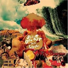
To help me design the digipak for 'Now I'm In The City' by American indie band I researched the band's previous album and single for ideas to show continuity from their version to mine. Here is the previous covers I have found for Creaky Boards:
 These covers show that Creaky Boards tend to lean towards the animated covers, avoiding images of themselves. This relates to Dyer's Paradox where the artist is both absent and present because while their image is absent the continuity in all their artwork shows them as present as they are easily recognisable.
 There are several conventions evident in these covers: firstly, the name of the band and album name is always in the top right hand corner. The font is also the same across all the covers, showing continuity across the Creaky Boards products meaning that although there is no image of the band for the audience to see, an image is constructed through this continuity as it allows the niche audience to recognise the band's products.
 Using these examples, I decided to follow the theme of animated album covers to help their target audience identify with the band. I also placed the band's name in the same corner it appears on the previous artwork for Creaky Boards. This is a further representation of the band.
 Due to the unknown status of the band, and therefore there only being a few album/singles covers to use, I had more room for creativity in the production of the digipak.
In terms of techniques used in my printwork to construct band image, I applied the 'posterised' filter to the entire digipak to give a sketchy look to it. This helps present the fun, easy-going feel I wanted to convey. I also layered the images slightly over one another to give a montage feel, to try and represent their day in the city- referring back to the title of the album.
Overall, I believe that I represent the artist in my printwork through using the conventions Creaky Boards have laid out for themselves by avoiding band images and instead contructing an image of the band by showing continuity among all their artwork.
Sunday, 27 November 2011
Group - Experimenting with Colours


These are print screens from a website we used to help us select our colour schemes for the colour matte's for the background of our studio shots.
We chose these colours because each pair of colours are complimentary and therefore work well together. Also, we chose to use these bolder, brighter colours instead of more pastel-y shades because of our decision to use a black and white filter on our studio footage too. The colours now stand out more and highlight the transitions as well as a fun atmosphere.
Saturday, 26 November 2011
AP - How are you representing your artist across the printwork?
In my advert I wanted to convey the idea that Creaky Boards are a down to earth kind of band that care more about their music making talents rather than being superficial and appealing to the mass pop culture audience.
 Because Creaky Boards are a rather obscure band they do not have many album covers or adverts. This has enabled me to be more creative when designing my advert as it means I haven't been obliged to stick to a particular theme. However, from the album Brooklyn Is Love I have gained an insight into what this theme could be. I have used a 'posterise' effect to create a sketchy cartoon look which gives a sense of surrealism and a retro feel which Creaky Boards exudes as a band.
Similarly to the album cover, I have put the band name on a black background so that it stands out and grabs the reader's eye and also creates a sense of continuity for the handful of people who may have come across them.
I have tried to represent the band as 'indie' through the use of a papyrus coloured background and sketchy writing with a few bold colours. This is a common theme in indie printwork as they use more earthy and natural colours.
Friday, 25 November 2011
AP - Production Log 25/11/11
Today I spent an hour adding more footage to our timeline and cutting it so that we can fill our timeline to make our final editing process next week easier. I managed to do this successfully as well as putting some effects in place. Next week I plan on finishing my advert and to pay more attention to the stop motion we have recorded as it is important to get this done as soon as possible because it is a relatively time consuming process. In addition to this we only have a week left to fully complete the whole video.
Thursday, 24 November 2011
YM- Studio Shoot 2 Reflection
On 22nd November we did our final shoot in the studio. This rounded off all our filming.
We found this shoot incredibly successful, re-filming shots that didn't work in our previous studio shoot; filler shots in the case that we need more footage; and all the boys singing the entire track so it is easier for us to cut performance into the music video.
We initially had trouble with the lighting. We set the white balance for added help, but we found that shadows were obvious on the blue screen, and the bright lights caused the actors to look either very yellow or blue. As a solution to this problem, we did some practise shots before the shoot, then uploaded the shots to premiere on the computer to review them on the screen as we found the camera moniter to be slightly deceiving. This action allowed us to gain an idea of what we need to do to change the lighting in our favour. After going through this process several times we managed to find good enough lighting that would be easy to work with in premiere during the editing process. We left the studio set up in the exact way in before the shoot began.
Tuesday, 22 November 2011
YM- Production Log 22/11/11
Today Abbi and I both played around with the editing process, I focused on editing some of our footage from the Dunorlan Park shoot to make it look quirky, and tried to play around with transitions for the split screen effect.
We also got some feedback on the bright colours we are using: while we like these colours, as do many others, we were told that pastel colours may look better, and this is something we will experiment with in our next lesson.
Finally, we finished our filming today, shooting the shots that needed re-shooting in the studio after school.
YM- Final Shoot
We have planned to re-shoot our studio shots that were unusable on 22/11/2011.
On this shoot we need to re-film:
We will endevour to keep an extremely close eye on the lighting and shadows, by testing shots before we begin our actual filming.
We also want to make sure that we pay more attention to framing, as many shots proved to not be framed well in our last studio shoot.
On this shoot we need to re-film:
- The stop animation shots: henry's moustache and the bus/statue of liberty shot
- All the boys singing the entire song- to help us edit in what we want
- Josh's split screen shot, as the lighting and shadowing was far too difficult to work with
We will endevour to keep an extremely close eye on the lighting and shadows, by testing shots before we begin our actual filming.
We also want to make sure that we pay more attention to framing, as many shots proved to not be framed well in our last studio shoot.
Monday, 21 November 2011
AP - Production Log 21/11/11
Today Yazmin and I shared the editing of the footage. I focused on cutting a lot of the footage that we do not have on our timeline yet. I feel I have made a lot of progress with our video by doing this as our focus has been quite concentrated on the beginning of the song rather than footage that we haven't used yet.
I also have been working on my advert in trying to find a font that would be visible on the background and would go with the font used to write the band name.
I also have been working on my advert in trying to find a font that would be visible on the background and would go with the font used to write the band name.
YM- Production Log 21/11/11
Today, we decided on the date when we will re-film the studio footage that we discovered was unuseable.
We were also shown how to set the white balance on the camera to hopefully prevent the same problem occuring.
In terms of editing progress today, I play around with split screen effects and colour matte effects for the studio shots, and had a look at the London footage with a black and white filter over it, which we have decided to use to show authenticity. We think the black and white filter will work because we plan on having a lot of studio shots, all of which will be brightly coloured and slightly crazy.

Friday, 18 November 2011
YM- Production Log 18/11/2011
Today I continued with editing sequences together for our music video, with a primary focus of ensuring the cutting rate is extremely quick, and continues through the video.
I planned to have a go at capturing stop motion animation for a couple of sequences in our video however, when I went to do this, we found that we could not find our SD card. Luckily, all our footage is backed up on the datadisk so we haven't lost anything, however we do need to refilm the shots for our stop motion idea.
I planned to have a go at capturing stop motion animation for a couple of sequences in our video however, when I went to do this, we found that we could not find our SD card. Luckily, all our footage is backed up on the datadisk so we haven't lost anything, however we do need to refilm the shots for our stop motion idea.
Thursday, 17 November 2011
YM- Production Log 17/11/2011
Today our main aim was to review the footage from our studio shoot yesterday and ensure it was usable. We came across a problem in our footage whereby the contrast was all off because we did not set the white balance before we began the filming. We didn't notice any issues with lighting and shadows while we were filming so this proved to be a disappointment.
After reviewing the footage, we played around with it in premiere, putting effects on it to adjust the lighting to make it look better. We went to 'edit' in premiere then 'effects' before applying the Brightness and Contrast, Blue Chroma Key, RGB and finally cropped the shot. This allowed us to make the shot look more realistic and presentable.
Due to this, we didn't get as much editing done as we would have hoped however, we feel we did make progress and now feel more confident for the duration of this project.
YM- Reflection of Studio Shoot
On 16/11/2011 we spent roughly around 5 hours in the studio shooting our final shots for our music video ready to complete the editing process after.
In many ways this shoot was a great success:
In many ways this shoot was a great success:
- We got footage to use as stop animation to add more variety and a more urgent sense of fun and enjoyability to our video.
- We got a range of close-ups and mid shots to make the video seem more like a music video rather than a short film.
- We managed to shoot our actors singing to the track allowing us to have lip-syncing in the video: something we didn't initially think we'd do.
However, we did encounter some problems during and after the shoot:
- The shooting took longer than we initially intended as we chose to shoot all our actors seperately so we could use the footage with effects, such as split screens and stop animation. The stop animation footage definitely took a lot of time.
- We didn't set the white balance before we began shooting and therefore when we uploaded our footage to premiere, the lighting and shadow was all wrong, some shots were even unusable which means we will now have to re-shoot those particular shots.
However, I believe this shoot was successful overall.
AP - Reflection of Studio Shoot
On the 16/11/11 we did our last shoot in the Drama studio so that we could get some close-up shots of our band members either doing quirky things or lip-syncing.
We had to set up the lighting so that it was bright and there were no shadows reflected onto the blue screen which we also used. By using the blue screen we can take the blue out and after we're left with a band member which we will put over a coloured background and then possibly add a few effects.
In our 'quirky' and 'fun' shots we used iconography such as a London bus and a minature Statue of Liberty to be visual signifiers that relate to world cities.
Another shot we got were the ones that we are going to use in a split screen. This went quite well as we only needed to get separate shots of the band members. However, we will see how this works when we experiment in Premier.
Wednesday, 16 November 2011
AP - Rough Cut Feedback
In our lesson on the 15/11/11 we tested out a rough cut on the rest of the class. We had about 50 seconds of footage and this was some of the feedback we received from the class:
Initial reactions were that it made the audience smile and accurately showed a band of four lads having a fun day out which was a key element in our pitch. Other comments made were that it was authentic.
The advice that we were given from our peers was that we needed a range of shots i.e. more close-ups and some p.o.v shots.
In addition to this it was suggested that we have more static shots and a faster cutting rate. These things we were aware of before we showed the rough cut and we plan to address these in our studio shoot and, of course, by editing.
Tuesday, 15 November 2011
AP - Advert Ideas 1

This is my first attempt at doing a magazine advert promoting Creaky Boards. Using the effect 'posterise' on a picture of a London street has given more cartoon and sketchy look which is what I am aiming for after having looked at previous album cover themes of Creaky Boards.
Monday, 14 November 2011
AP - Production Log 14/11/11
In today's lesson we had to focus on doing our rough cut. However, we also had to upload the footage from the Dunorlan shoot that Yazmin did on the weekend.
So far we have approximately 1 minute of footage that we can use as our rough cut but, ideally, we would like to get some of the Dunorlan footage in there too. As a result of this, today we will focus on watching and selecting appropriate footage from Dunorlan before we export a rough cut which we intend to finish tomorrow.
So far we have approximately 1 minute of footage that we can use as our rough cut but, ideally, we would like to get some of the Dunorlan footage in there too. As a result of this, today we will focus on watching and selecting appropriate footage from Dunorlan before we export a rough cut which we intend to finish tomorrow.
Sunday, 13 November 2011
CF - feedback planning
Abby/Yasmin - 4-
Well done - this is a consistent document of your planning, research and production process. Research is underpinned by critical theory and you use this to make relevant and useful observations on similar texts.
To secure a L4, you do now need to be very reflective on your production process and use ICT to communicate ideas - screenshots, before/after images. You need to reflect on the animatic process more specifically too.
YM- Dunorlan Park Shoot, 12/11/2011
On Saturday 12th November, we took our actors to Dunorlan Park to re-shoot some shots that we filmed in London that were technically incorrect. Specifically, we had to use the tripod for each shot to ensure that we have plenty of static shots to use in our music video.
Our actors wore the same costume as they wore for the shoot in London which will help show the continuity in the video as we cut between locations.
We did however face some problems on the day:
Firstly, the weather wasn't as bright as was forecast and therefore this may affect the mood/atmosphere portrayed in our video as the sky was very misty and grey unlike the footage from London where the sun was shining for the majority of the time. The best proposition for a solution to this is to play around with the brightness/contrast and the saturation to use help us brighten the footage up.
Another problem we encountered was one of our actors unable to make the shoot at the very last minute. This was a problem because it left us unable to shoot the band shots we had planned to, meaning there is now more pressure on us to get these shots in our final shoot in the studio. As we were at the location with the equipment and actors we decided to go ahead with the shoot but improvised with creative shots that when cut into our music video with the fast cutting rate will not be too noticeable that one member is missing. Luckily for us, the actor that didn't turn up was the member of the band that appears the least in the London footage and therefore it shouldn't be too obvious.
Overall, I believe the shoot was successful because the actors followed our instructions well and we were able to re-shoot all the shots we wanted to as well as experiment and film shots that are different and fun, therefore fitting with our track. The only shots we didn't get we wanted to was the band shots, however we still have the chance to overcome this issue.
Saturday, 12 November 2011
YM- First digipak ideas from Photoshop
Having used the sketches I designed in rough for the digipak, I have been playing around in Photoshop Elements with photos I took on our recce to London, and experimented with different filters and effects.
This is the first design that I have come up with that could be used on my final digipak.
Here is the inside pane, opposite the CD:
 It is a photo I took of one view of Covent Garden, using the rule of thirds to place the red telephone box in one third of the photo to draw attention to it as it is bright and iconic. This photo has had the 'posterize' filter applied and I changed the intensity to give a more arty/sketchy look for a more fun, laid-back feel.
The following pane is the CD pane:
 Again, this is one photo I took of a fountain while in Leicester Square, with the incredibly famous national Art gallery in the background, therefore continuing with London iconography. Again, i applied a 'posterize' filter to help give more of a fun mood to the text.
The next pane is the back cover of the digipak:

Again, the posterize filter has been applied to give a more arty, fun mood to keep with the running theme of fun, light-heartedness. This is a photo i took on our recce to London.
Finally, this is the font pane for my digipak first ideas:

This is the first design that I have come up with that could be used on my final digipak.
Here is the inside pane, opposite the CD:

The following pane is the CD pane:

The next pane is the back cover of the digipak:

Again, the posterize filter has been applied to give a more arty, fun mood to keep with the running theme of fun, light-heartedness. This is a photo i took on our recce to London.
Finally, this is the font pane for my digipak first ideas:

Thursday, 10 November 2011
YM- Production Log 10/11/11
Today Abbi took the role of editing, trying to select more appropriate clips for the video while I continued research and experimenting with ideas for the digipak. We found a single cover for Creaky Boards which is similar to the album cover in terms of design and style so it has given me more ideas and a clearer vision as to what direction the digipak should go in.
Wednesday, 9 November 2011
YM- Production Log 9/11/11
Today, I began the editing of our music video using the animatic as a basis on video 1, then gradually slotting in the clips we want to use in the right place on the timeline.
While I was doing this Abbi was making a start on the advert printwork which she is in charge of, playing around with ideas and fonts and generally experimenting.
While I was doing this Abbi was making a start on the advert printwork which she is in charge of, playing around with ideas and fonts and generally experimenting.
AP - Dunorlan Park Shoot 12/11/11
On Saturday 12th November we are planning on doing a shoot in Dunorlan Park to get some revised footage in an urban park environment as some of our footage from London was too shaky and we need to use the tripod to achieve more smooth shots.
However, seeing as I am unable to make the shoot I am going to post some of my ideas to help Yazmin and the band.
This is what I think you should aim to achieve:
However, seeing as I am unable to make the shoot I am going to post some of my ideas to help Yazmin and the band.
This is what I think you should aim to achieve:
- Close-ups of the band to use as meat shots. This is important because it makes the audience feel closer to the singer/ band.
- Revised 'flower pot' shots. Have fun and get the boys to jump up from behind objects. Try and aim to keep it looking like a London park though.
AP - Font Ideas for Advert
Here are some examples of the fonts we think would be appropriate for our advert and album cover. At the moment our favourite is Got Heroin? which is the second image shown below.
 Katana Shadow
 Blue Highway Lin...
Phorssa
Mia's Scribblings
MANIATICO!
 Katana Shadow
JuneBug
green piloww
Got heroin?
Destroy
Broken 15
 Blue Highway Lin...
Blox (BRK)

YM- Digipak sketch ideas 1
Below are a couple of digipak ideas which I have sketched roughly with my initial ideas of what we could do.
This is the album cover:

This is the Back of the digipak:

This is the album cover:

This is a collection of images of iconic london iconography and landmarks that reinforce the idea of being in the city, and compliments the music video nicely as that was filmed in London.
This is the Back of the digipak:

The images are one of the band, to show band camaraderie and the other two are meant to be funny, quirky shots of the members in the band to reinforce this light-hearted mood and atmosphere we are trying to create.
Tuesday, 8 November 2011
YM- Production Log 8/11/2011
Today Abbi was responsible for uploading our animatic onto the blog along with some comments on how it has and will help us with this project.
While she was doing this, I took the time to go through all the posts on the blog to make sure all the necessary posts were on the blog and to the correct standard.
I then follwed this by using the final 20 minuets of the hour to research ideas for the digipak- of which I am creating. The best album cover I found that will really help me generate ideas is Creaky Boards' only album cover. This will give me an idea as to how we should present the band. I have several ideas which still need further development and experimenting before I begin producing the digipak.
Monday, 7 November 2011
YM- Production Log 7/11/2011
In today's lesson, we discussed the shoots we still need to do, regarding where and when and worked out exactly what we need to do in each shoot to achieve our goals.
I checked the weather to help us plan our exterior shoot and from there decicded to give ourselves a week of reviewing and editing footage before we did our final shoot- the weather wasn't a concern here because this shoot is going to be an interior shoot in the drama studio for some performance shots.
While I was writting up a post on what we decided, Abbi was ensuring all our storyboard and animatic posts were on the blog and up to date to give evidence of our planning and show our thought process.
Group- Upcoming Shoots
After reviewing our footage, it is clear that we are unable to use a selection of our favourite shots as we still had the camera on the handicam frame rather than using the tripod for static shots. We can see these shots in our music video and therefore we need a shoot in a park to recreate these shots in a more technically advanced way.
There are several difficulties with this:
As these shots will hopefully be incorperated into the footage we captured on our main shoot in London, we need to find a time and day when the sun is forecast as the weather was bright on our filming day. To make this less of a problem, I have checked several weather websites for forecasts over the next 5 days to find the sunniest, brightest day to select.
Also, due to re-shooting footage, our actors will need to be wearing the same costume as they wore before to show continuity. This can be overcome by giving the actors several days notice to be prepared for this.
We have discussed this shoot and have decided collectively as a group that the best time for this shoot is during a lunch time as it will be difficult to find a period where our entire group is free and after-school will not give us enough time due to early sunset. Therefore we have decided THURSDAY 10TH NOVEMBER lunch time looks most promising when considering the problems we are likely to face.
We are also discussing the possibility of a shoot in the drama studio against a green screen for some filler shots inbetween our footage. These shots will show the group together to give a feel of Band Authenticity as we want them to appear present to our audience to connect with them more intimately. We are likely to do a shoot like this as we can portray a sense of fun and make the shots more joking to anchor the mood and atmosphere of the track.
Weather is not an issue for the duration of this shoot and therefore we plan to do this after school one day next week (commencing 14th November) most probably on the TUESDAY/WEDNESDAY (depending on availability) so we do not leave the filming too late and give ourselves as much time as possible for the editing process.
Thursday, 3 November 2011
AP - Digipak Ideas

For our digipak we are doing a single cover rather than an album as there is already an album cover by Creaky Boards that I want to use as inspiration. As i am doing the advert I have a larger surface to work with but I also need to work with Yazmin so that we can create some sense of continuity through our advertising. This is important because to grab our audience's attention we need them to be able to recognise a style that is relevant to the band and can be seen on posters as well as on the CD pack.
A general style I would like to convey on my advert is one of an artistic yet not artificial nature. I am thinking about doing a sketch of our band or, similarly to the album Brooklyn Is Love, have cut out bits of magazine and create a city, to relate to the song 'Now I'm In The City'. In addition to this I also want it to create a 'retro' feel with worn out but bright colours.

Wednesday, 2 November 2011
AP - Production Log 2/11/11
Today we uploaded all the footage that we shot in london and went through it all to decide which ones would be suitable for our video. We opened up Premier and have started a new project so that we can begin editing. At the moment we have 45 minutes of footage on our timeline, however, we feel that we can cut this down so dramatically that we may not have enough to fill the 3minutes 56 seconds of our song. As a result of this worry we are planning on doing some 'fun' performance shots in the drama studio as fillers. We are still in discussion of this though and hope to finish a plan by the end of this week.
Subscribe to:
Comments (Atom)