On Monday 24th October, Abbi and I went to London for our shoot with our actors. We had split the required equipment between us so we were both responsible for ensuring we had all the equipment we would need.
Abbi was generally in charge of the producer/director roles while I focused on the cameraman roles. However we did have a chance at each others roles so that we both contributed creatively in all aspects of creating a music video.
We did face a couple of technical problems that caused us to find a solution. Firstly, we arranged to meet at 10am at Waterloo Station, however we fell behind schedule early on when our actors missed the stop and went over to Charing Cross before having to get back to Waterloo to meet us. Regardless of our late start, we got to work as soon as they arrived, filming them walking through Waterloo Station, not wasting anymore time. We knew at this point that we had to get to each location quickly and film the footage with no messing about. Also, we were aware that sunset is earlier in autumn months and this late start would put us at risk of not finishing our filming in time for sunset hence our need to continue from location to location as quickly as possible.
Another problem we faced was the batteries running out half way through the day, giving us no way to work the camera. We took 2 fully charged batteries with us on the shoot but due to our narrative following the day of a group of men, it was essential to have the camera on between loactions to capture some more natural footage for the video. To overcome this, we took a break and went to find an electric plug which we could use to charge the batteries. This, of course, put us slightly behind in our schedule but with the battery charged enough to last us the rest of our day it was extremely beneficial.
Overall, the day went really well, we captured a wide range of footage that we had planned to take and caught some really natural moments which is an important element in indie videos. It was rather challenging having to direct 4 teenage boys to act in different ways but if we decide to do a shoot of the band performing to get more close-ups then we will have knowledge on how to direct them better. Similarly, it should be easier to film in a confined space as there is no risk of members feeling embarrassed and we can adjust the lighting to our specifications.
Tuesday, 25 October 2011
Friday, 21 October 2011


Thursday, 20 October 2011
Group- Concept and Treatment
Mise-en-scene
In terms of costume, we want to keep it relatively modern due to the band being a modern band, however we do want to portray a more 'old-school' 60's/70's vibe which is quite apparent while listening to the song. We plan on having our characters wear converse, normal, everyday jeans and each wearing a top with a different band/artist that are iconic to the 60's/70's era's to help with this feel. We also would like our 'front man' to have a full beard and for the others to have some kind of stubble as the members of Creaky Boards all have facial hair and is therefore almost a trademark for their band.
For props, we aren't planning on having too many, but we would like to give the image of stereotypical tourists and we plan to accomplish this by showing the characters using a large map of London to get around, and having camera's hanging from a strap around their neck while constantly taking photographs.
In terms of locations within London, we have decided to use the biggest, iconic landmarks in the city as the characters are away on holiday. The sights we have chosen are:
The characters in the music video are going to be the artists, performing at times while acting out the narrative.
The band is made up 5 men, however we plan to use 4 in our video, to keep the feel of a male indie band.
Story
The narrative shows a man, who has recently split with a girlfriend escaping his town to go to the city with his friends. Expanding on this, we have decided that these men decide to visit London for a break and turn out to act like the typical tourist.
He is seen to be happy and enjoying being free and away from his couped up life back home. He feels liberated, and this easy-going, light-hearted, excited feel is one we want our video to be full of.
A lads day out in London sightseeing.
Locations
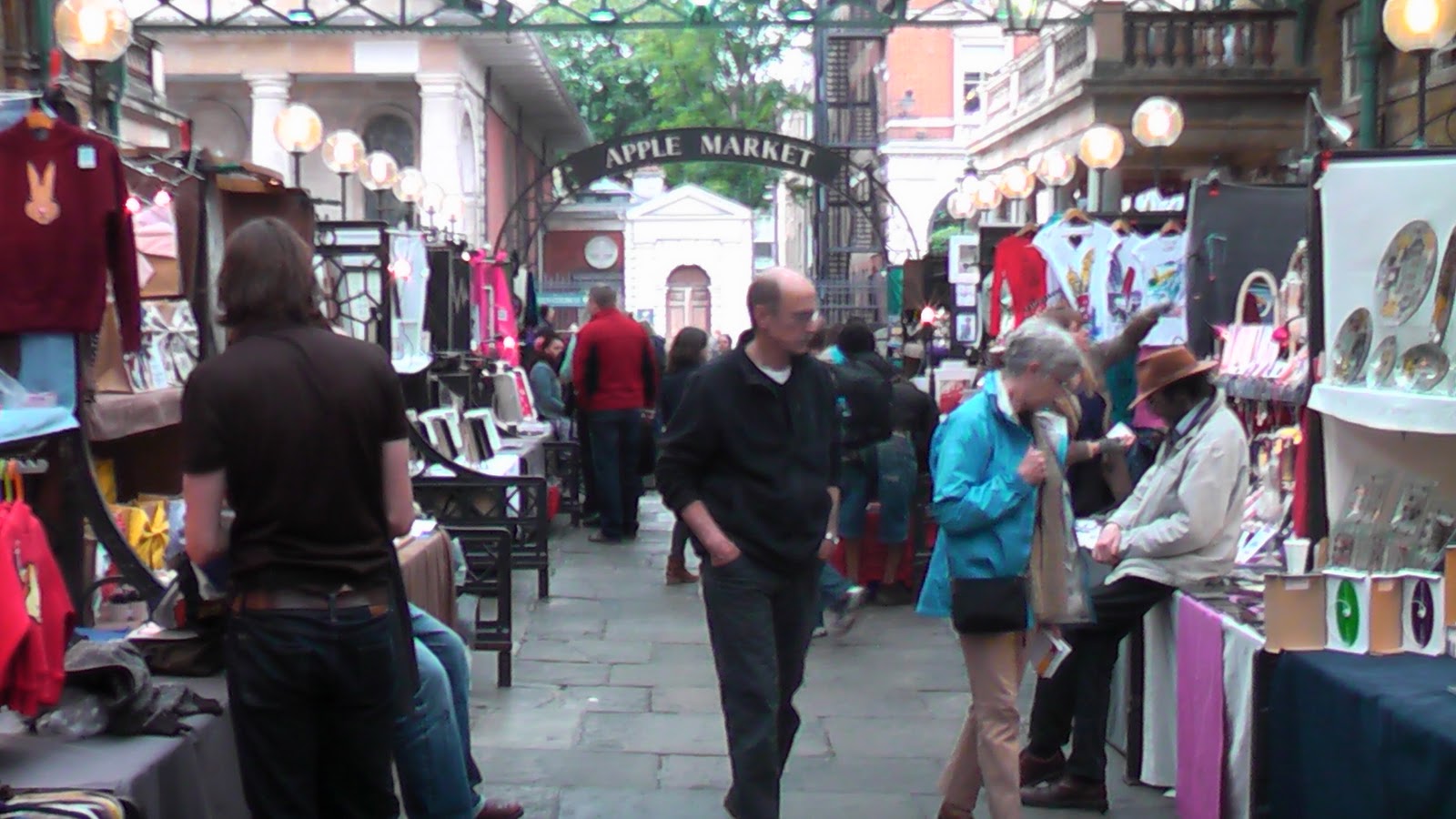
For our location, we have chosen London, a big bustling city- due to the lyrics and track title 'Now I'm In The City'. We chose London because it is a popular get-away destination for people around the world and the story is about a man escaping his town due to a recent break-up.In terms of locations within London, we have decided to use the biggest, iconic landmarks in the city as the characters are away on holiday. The sights we have chosen are:
- Trafalgar Square
- The London Eye
- The South Bank
- Buckingham Palace
- Green Park
- China Town
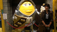
- Leicester Square / M&M World
- Tube/Underground
- Covent Garden
The characters in the music video are going to be the artists, performing at times while acting out the narrative.
The band is made up 5 men, however we plan to use 4 in our video, to keep the feel of a male indie band.
Story
The narrative shows a man, who has recently split with a girlfriend escaping his town to go to the city with his friends. Expanding on this, we have decided that these men decide to visit London for a break and turn out to act like the typical tourist.
He is seen to be happy and enjoying being free and away from his couped up life back home. He feels liberated, and this easy-going, light-hearted, excited feel is one we want our video to be full of.
A lads day out in London sightseeing.
Tuesday, 18 October 2011
Group- Lesson 18/10/2011
Today we made progress in with our storyboard so it will be ready for an animatic later in the week.
During this, we decided to play the song to help up visualise what we were drawing. While on YouTube, we discovered a CreakyBoards YouTube channel that belongs to the band. We had not yet before come across this in our research. The channel contains videos of their perfomances and general videos of them together as a band. This will give us further research with 'band comardarie' and help us direct our actors during the shoot in relation to how they can appear more like the men in Creaky Boards present themselves together. We also have a clearer idea of costumes and props that they would likely have in a video of theirs.
During this, we decided to play the song to help up visualise what we were drawing. While on YouTube, we discovered a CreakyBoards YouTube channel that belongs to the band. We had not yet before come across this in our research. The channel contains videos of their perfomances and general videos of them together as a band. This will give us further research with 'band comardarie' and help us direct our actors during the shoot in relation to how they can appear more like the men in Creaky Boards present themselves together. We also have a clearer idea of costumes and props that they would likely have in a video of theirs.
Group - Animatic
This is our animatic of our storyboard. By positioning the different shots in the order we want to the track we can visualise how our video will look on the final edit.
So far, this is a rough idea of what we want our video to look like. We will probably add a larger variety of shots further into the edit when our ideas develop further.
Monday, 17 October 2011
Group- Feedback from Pitch
After pitch our research and concept to the class, we received some feedback from some people. Our feedback includes:
- The use of lip syncing shots: someone raised the question as to whether we were planning any shots of this type, however we managed to explain our ideas in relation to this using some of the images from our recce.
- There was also a question raised as to whether all our shooting could be done in one day, considering the amount of footage we need to collect and the amount of time it will take for us to move around London. I think that after our recce we have a clear idea as to where we want to go for what so there will be no messing about.
Sunday, 16 October 2011
YM- Reflection on Audience Research
Audience research is a great way to gain an insight as to what a general audience thinks of our chosen genre and their initial reactions to our track and first ideas.
We chose to undertake our audience research as a survery on SurveyMonkey. This is because it allowed us to ask different types of questions to be answered differently, depending on the type of response we were looking for. We often asked our respondee's to tick boxes to inform us of their thoughts and ideas.
Here are a couple of examples of a 'tick the boxes that apply' question:


These questions were helpful because they allowed our respondees to select all that apply which is a positive thing because it is always possible for someone to have different views on something, maybe even contrasting. We did get a response that contradicted themselves, selecting the 'Happy', 'Upbeat', 'Hopeful' and 'Pessimistic' which suggested to us that different parts of the song connoted different feelings.
We also had a rating question where we asked respondees to select on a scale depending on their personal opinion. Here is the question:
 This question worked well because it allowed more freedom for our respondees to give their thoughts on our ideas.
We only used closed questions except for the second question:

We chose to put in this one open question so we could quickly and easily gain an insight to the respondees initial response to hearing the track for the first time. It made the responses more real and genuine and therefore helped us understand the track slightly better.
Overall, I definitely found this audience research survey a worthwhile task as we got to discover how other people interpreted a track: even more important for us because the song is practically unknown. The task, therefore, helped us shape our initial ideas into something more realistic and substantial.
We chose to undertake our audience research as a survery on SurveyMonkey. This is because it allowed us to ask different types of questions to be answered differently, depending on the type of response we were looking for. We often asked our respondee's to tick boxes to inform us of their thoughts and ideas.
Here are a couple of examples of a 'tick the boxes that apply' question:


These questions were helpful because they allowed our respondees to select all that apply which is a positive thing because it is always possible for someone to have different views on something, maybe even contrasting. We did get a response that contradicted themselves, selecting the 'Happy', 'Upbeat', 'Hopeful' and 'Pessimistic' which suggested to us that different parts of the song connoted different feelings.
We also had a rating question where we asked respondees to select on a scale depending on their personal opinion. Here is the question:

We only used closed questions except for the second question:

We chose to put in this one open question so we could quickly and easily gain an insight to the respondees initial response to hearing the track for the first time. It made the responses more real and genuine and therefore helped us understand the track slightly better.
Overall, I definitely found this audience research survey a worthwhile task as we got to discover how other people interpreted a track: even more important for us because the song is practically unknown. The task, therefore, helped us shape our initial ideas into something more realistic and substantial.
Friday, 14 October 2011
Wednesday, 12 October 2011
YM- Album Artwork Analysis
Noah And The Whale 'The First Days of Spring'

Genre
The genre of this band is Indie Rock and it is obviously evident from the first glance of the album cover. It conforms to typical indie conventions whereby the artist(s) are presented to the audience on the cover. Usually they are face onwards, showing how this band has slightly strayed from the typical conventions, however they are still incredibly present, almost offering themselves to their audience. Simplicity is a key word that describes indie artwork and here Noah And The Whale have conformed to this, keeping a plain background, and just a simple image over the image of themselves.
Media Language
In terms of visual techniques, selective focus is the most obvious one used on this digipak, clearly emphasising the lead singer of the band to the audience. This tells the audience a bit more about the band. However, the use of the pull focus takes away some of the 'band comorardarie' (by singling out one member of the band) which initially seems apparent, and is commonly seen on the album covers for Indie artists.
The colour and lighting used here reflects the name of the album 'The First Days of Spring' through the use of blues and greens: colours stereotypically connoting spring and is therefore a cultural code linking to the title of their album. However, they have been careful to make the colours appear lighter and washed out so the audience doesn't quickly assume thoughts of summer, which does happen with bright colours.
Representation
The band seem to be representing themselves on this album cover as free and easy going, shown through the everyday costume and the fact they are supposedly seen in a field with endless sky behind them, representing how they see themselves in the music industry: everything to play for. This helps them sell their product because the attitude they are portraying here is one that is very relatable to 'average, everyday' people. Dyer's paradox 1 is seen here: extraordinary because they have themselves and their band name on an album cover for everyone to see, representing their success, but their casual costume and laid-back attitude presents a very ordinary way of life. Therefore their target audience will have more way in which to connect with this band and are therefore more likely to purchase the music.
Saturday, 8 October 2011
Group - London Recce


Overall, we had a successful trip, having experiemented with all the shots we planned to, and capturing stills as well as film footage.
However, we did come across several problems throughout the day which we had to overcome. Firstly, we did struggle to fit in all of the locations we had planned to visit as we didn't anticipate how long we would need at each location to fully have a look around and play around with angles and ideas at each location. From this we learnt that for our actual filming day we need to start later and be prepared to stay in London later, as well as knowing that we have no time to play around in the day.
Another problem we faced was the wind as it made it difficult to film with a handicam, which forms the majority of our music video and also the weather was dreary and grey, which gave the wrong mood and atmosphere to what we want for our video. This made us really aware of just how important the weather is and to be prepared for a last minute change of days for our real shoot as well as checking weather forecasts everyday.
Overall, I believe that this recce was the best way to really assess if our ideas would work by visiting the locations we would like to shoot. It was a successful day and we are still extrememly keen to keep the idea we have at the moment.

Friday, 7 October 2011
AP - Album Cover Analysis

I have chosen this album cover because it is in the same genre as my chosen track and so i thought it would be useful to gain a wider understanding of how to attract my audience.
The indie audience are quite focused as consumers and so it takes something unconventional to grab their attention.Genre
- Indie artists have a tendency to have simplistic album cover. For example, here there is only one main picture, a sketch of a man with ambiguous coloured items in his mouth. Although, it may be simple and on a beige/ off yellow background it is still eye catching. This creates an incoherence which attracts the more 'indie' audience.
- The band are not shown on the album cover and therefore cannot really create a sense of band authenticity, particularly seeing as, when compared to another Foals album cover (below), there is no continuity.

Media Language
- In terms of visual techniques the name of the band and the name of the album are central and are put together as if they were one word. However, to be able to differentiate between the band and album names 'Foals' is an outline and 'Antidotes' is jet black. This contrast between plain and bold is interesting to the audience as, just like seeing black and white stripes, it is eye catching.
- Rule of thirds has not been applied to this album cover so the image and text is central and immediately our eyes are drawn to this central image.
- The title of the album 'Antidotes' connotes that the album is one you would listen to in order to make you feel happy listening to their music rather than depressed by the 'poisoning' of everyday life, for example, as an antidote is 'something that counteracts or neutralizes an unpleasant feeling or situation.'
- Ultimately, the band are presented as a band who care more about their musical talents rather than appearing as popular and stereotypical, which is a common theme in indie bands. This is evident through the simplicity of the cover with it's mostly neutral colours and sketchy design.
Wednesday, 5 October 2011
AP - DIGIPAK Discussion
Following our creation of a music video we also must create a Digipak which includes an album cover and a single/ album advert that is suitable for a magazine or newspaper.
Yazmin, would you like to be in control of the Digipak or the advertisement?
Once we've decided this we should do some group research to collect some examples of album covers from our genre.
Yazmin, would you like to be in control of the Digipak or the advertisement?
Once we've decided this we should do some group research to collect some examples of album covers from our genre.
Monday, 3 October 2011
Group- Audience Research, Survey Monkey Questionnaire
Please click the following link to take a look at our survey.
Click here to take survey
We have given the link to the track and have asked questions that will hopefully force the respondeees to give their initial thoughts and feelings on the different areas and technical aspect.
This should help us finalise our concept before we pitch to a focus group.
Click here to take survey
We have given the link to the track and have asked questions that will hopefully force the respondeees to give their initial thoughts and feelings on the different areas and technical aspect.
This should help us finalise our concept before we pitch to a focus group.
Subscribe to:
Comments (Atom)